
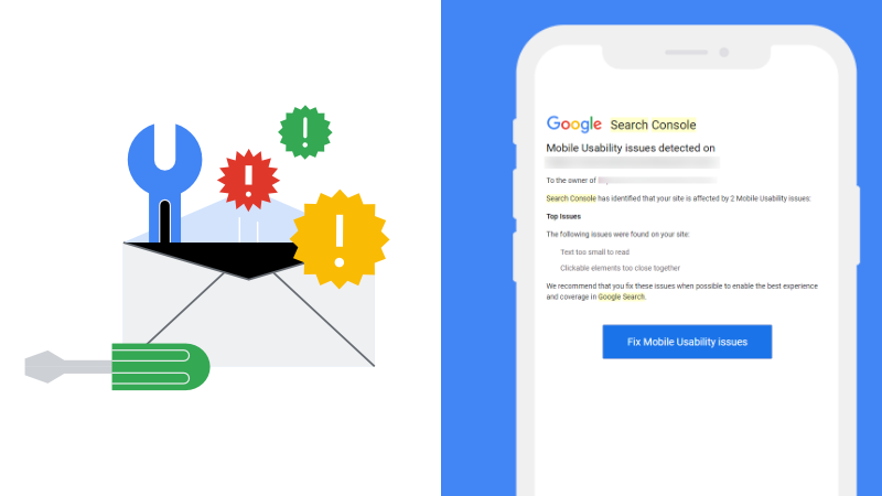
Mobile usability has become a critical factor in website success, with Google prioritizing mobile-first indexing and user experience. When Google Search Console flags mobile usability issues on your website, it’s sending a clear signal that your site may not be providing an optimal experience for mobile users. These notifications can be concerning for website owners, especially when everything appears to function correctly on desktop devices.
The reality is that mobile usability issues can significantly impact your search engine rankings and user engagement. With over half of all web traffic coming from mobile devices, ensuring your website performs flawlessly across smartphones and tablets isn’t just recommended—it’s essential for maintaining competitive visibility in search results.
However, not all mobile usability warnings are created equal. Sometimes Google Search Console reports issues that don’t actually exist, creating confusion for website owners who see perfectly functional mobile sites. Understanding how to properly diagnose, verify, and fix these issues is crucial for maintaining strong search performance and providing excellent user experiences.
This comprehensive guide will walk you through the entire process of identifying genuine mobile usability problems, distinguishing between real issues and false positives, and implementing effective solutions. Whether you’re dealing with content that’s wider than the screen, clickable elements that are too close together, or text that’s too small to read, you’ll learn proven strategies to resolve these problems and prevent them from recurring. By the end of this, you’ll have the knowledge and tools necessary to maintain a mobile-friendly website that both users and search engines will appreciate.
Understanding Mobile Usability Issues in Search Console
 Mobile Usability Issues (Image via Getty)
Mobile usability issues in Google Search Console represent problems that can negatively impact how users interact with your website on mobile devices. These issues are identified through Google’s automated crawling and testing processes, which evaluate how well your pages perform on smartphones and tablets.
The most common mobile usability errors include content wider than the screen, where page elements extend beyond the mobile viewport, clickable elements too close together, which makes navigation difficult on touch screens, and text too small to read, where font sizes are insufficient for mobile viewing. Other frequent issues include viewport configuration problems and pages that simply aren’t usable on mobile devices.
It’s important to understand that Google uses mobile-first indexing, meaning they primarily evaluate the mobile version of your website when determining search rankings. This makes addressing mobile usability issues critical for maintaining strong search performance and ensuring your content remains discoverable.
Identifying False Positives and Google Bugs
One of the most frustrating aspects of mobile usability monitoring is dealing with false positives. Google Search Console has a known bug that occasionally reports mobile usability issues on pages that are actually functioning correctly. This can lead to unnecessary concern and wasted time trying to fix problems that don’t exist.
To verify whether a reported issue is genuine, start by clicking the “Fix Mobile Usability issues” button in the email notification from Google. This will take you directly to the Mobile Usability report in Search Console, where you can examine specific examples of problematic pages.
The key to verification lies in using Google’s Mobile-Friendly Test tool. After identifying the specific pages flagged with issues, click on the examples section and select “Test Live Page”. This opens Google’s Mobile-Friendly Test, which provides a real-time assessment of how Google’s crawlers see your page on mobile devices.
If the test shows your page as mobile-friendly despite the Search Console warning, you’re likely dealing with a false positive. In such cases, you can simply validate the fix in Search Console without making any changes to your website.
Diagnosing Real Mobile Usability Problems
 Mobile Usability Issues (Image via Getty)
When mobile usability issues are genuine, proper diagnosis is essential for effective resolution. The most reliable method involves using Chrome DevTools to inspect your pages in mobile view. This allows you to see exactly how your content appears on different screen sizes and identify specific elements causing problems.
Start by opening your website in Chrome and accessing DevTools by pressing F12 or right-clicking and selecting “Inspect”. Switch to the device toolbar to simulate various mobile devices and screen sizes. Look for elements that extend beyond the viewport width, text that appears too small, or interactive elements that are positioned too closely together.
Pay particular attention to images without width attributes, code blocks with long lines, and content with extremely long words that don’t wrap properly. These are common culprits that can cause layout issues when CSS fails to load completely during Google’s crawling process.
Common Causes and Technical Solutions
The root cause of many mobile usability issues stems from elements that become problematic when CSS resources fail to load during Google’s crawling process. This can happen when the Googlebot is processing pages quickly and doesn’t fetch all page resources.
Content Wider Than Screen issues often result from images, videos, or code snippets that lack proper width constraints. The solution involves ensuring all media elements have maximum width properties and that container elements don’t exceed viewport boundaries.
Clickable Elements Too Close Together typically occurs when buttons, links, or interactive elements don’t have adequate spacing for touch interaction. Google recommends maintaining at least 48 pixels of space around clickable elements to ensure comfortable mobile navigation.
Text Too Small to Read problems arise when font sizes fall below Google’s minimum readability standards. Ensure your base font size is at least 16 pixels and that text scales appropriately across different screen sizes.

 Mobile Usability Issues (Image via Getty)
Implementing Preventive CSS Solutions
A proactive approach to preventing mobile usability issues involves implementing a CSS snippet that provides fallback styles when your main stylesheet fails to load. This solution addresses the core problem of elements breaking mobile layouts when CSS resources are unavailable.
<style>

:where(body, iframe, pre, img, svg, video, canvas, select) {

max-width: 100%;

overflow: auto;

word-break: break-word;

}

</style>
This code snippet should be placed in the <head> section of your pages, preferably before your main stylesheet link. The :where() selector ensures these styles have zero specificity, allowing your regular CSS to override them when it loads properly.
The max-width: 100% property prevents elements from exceeding viewport width, overflow: auto ensures content doesn’t push elements beyond their boundaries, and word-break: break-word handles long words that might otherwise break layouts.
Testing and Validation Process
After implementing fixes, thorough testing is crucial to ensure problems are resolved. Use Google’s Mobile-Friendly Test tool to verify that your changes have addressed the reported issues. This tool provides immediate feedback and shows exactly how Google sees your page.
Additionally, test your fixes across multiple devices and screen sizes using Chrome DevTools or actual mobile devices. This comprehensive testing approach helps identify any remaining issues and ensures your solutions work across different contexts.
Once you’re confident in your fixes, return to Google Search Console and click “Validate Fix” for the affected pages. Google will re-crawl your pages and update the mobile usability report accordingly. This process typically takes a few days to complete, so patience is required while Google processes your changes.
Monitoring and Ongoing Maintenance
Maintaining mobile usability requires ongoing attention and regular monitoring. Set up alerts in Google Search Console to receive notifications about new mobile usability issues as they arise. Regular monitoring helps you catch problems early before they impact significant portions of your website.
Consider implementing responsive design principles throughout your website development process. Responsive design automatically adjusts layouts based on screen size, preventing many mobile usability issues from occurring in the first place.
Regular audits using tools like Chrome DevTools Lighthouse can help identify potential mobile usability problems before they’re flagged by Google. This proactive approach allows you to address issues during development rather than after they’ve already impacted your search performance.