In today’s digital world, where mobile devices account for over 58% of global web traffic, responsive design has evolved from a nice-to-have feature to an absolute necessity. Responsive web design (RWD) represents a fundamental approach to web development that ensures websites render beautifully and function seamlessly across every device imaginable – from smartphones and tablets to laptops and desktop monitors.
The concept goes far beyond simply making websites “mobile-friendly.” Responsive design creates dynamic, fluid experiences that automatically adapt to users’ viewing environments, whether they’re browsing on a 5-inch phone screen during their morning commute or working on a 27-inch desktop monitor in their office. This adaptability is achieved through sophisticated techniques including flexible grid systems, scalable images, and CSS media queries that intelligently adjust layouts based on screen dimensions and device characteristics.
The stakes couldn’t be higher for businesses and organizations. With 92.3% of internet users accessing the web through mobile phones, a non-responsive website essentially alienates the majority of potential visitors. Users encountering poorly optimized sites face frustrating experiences – forced zooming, difficult navigation, and distorted content – leading them to abandon these sites within seconds. Search engines like Google have recognized this user preference shift, implementing mobile-first indexing and algorithm updates that prioritize responsive, mobile-optimized websites in search rankings. This means responsive design directly impacts not just user satisfaction, but also online visibility, organic traffic, and ultimately, business success in the competitive digital marketplace.
Understanding Responsive Design Fundamentals
Responsive web design operates on three core technical principles that work together to create seamless cross-device experiences. Fluid grids form the foundation, using relative units like percentages instead of fixed pixels to ensure page elements resize proportionally across different screen sizes. Flexible images complement these grids by scaling dynamically within their containers, preventing overflow issues that plague non-responsive sites.
The third pillar, CSS media queries, acts as the intelligent decision-maker, applying different styling rules based on device characteristics such as screen width, height, and orientation. These queries create breakpoints – specific screen widths where the layout transforms to optimize the viewing experience. For example, a three-column desktop layout might automatically reorganize into a single-column mobile layout when viewed on smaller screens.
Modern responsive design has evolved beyond these basics to incorporate advanced techniques, including CSS Flexbox and Grid systems, which provide more sophisticated layout control. The approach also emphasizes mobile-first design strategies, where developers begin with mobile layouts and progressively enhance for larger screens, ensuring optimal performance across the device spectrum.
The Business Impact of Responsive Design
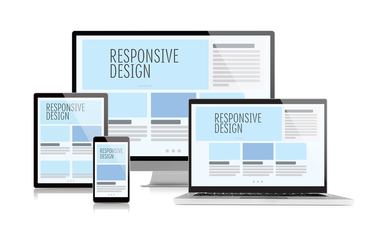
 Responsive Design (Image via Getty)
The benefits of implementing responsive design extend far beyond technical considerations, delivering measurable business value across multiple dimensions. Enhanced user experience stands as the primary advantage, with responsive sites providing smooth navigation, readable content, and intuitive interactions regardless of device. This improved experience directly translates to reduced bounce rates and increased user engagement.
SEO performance receives a significant boost from responsive design implementation. Search engines favor mobile-friendly websites, and responsive design signals to Google that your site prioritizes user experience. This preference results in higher search rankings, increased organic traffic, and improved online visibility. The streamlined approach of maintaining one responsive website rather than separate mobile and desktop versions also makes it easier for search engines to crawl and index content effectively.

From an operational perspective, responsive design offers substantial cost and maintenance efficiency. Managing a single responsive website eliminates the complexity and expense of maintaining multiple site versions for different devices. Updates, content changes, and design modifications need to be implemented only once, saving both time and resources while ensuring consistency across all platforms.
Performance optimization represents another crucial benefit, with responsive sites typically loading faster due to their streamlined architecture. This speed improvement enhances user satisfaction and contributes to better search engine rankings, creating a positive feedback loop for online success.
Future-Proofing Your Digital Presence
Responsive design serves as a strategic investment in your website’s longevity and adaptability. As new devices with varying screen sizes continue to emerge, responsive websites automatically accommodate these innovations without requiring separate development efforts or costly redesigns. This future-proof approach ensures your digital presence remains accessible and professional regardless of technological advances.
The mobile-first reality of modern internet usage makes responsive design not just beneficial but essential for capturing and retaining audience attention. With mobile browsing having surpassed desktop usage, responsive design helps maximize reach and engagement while building the trust and credibility that drive conversions and business growth.